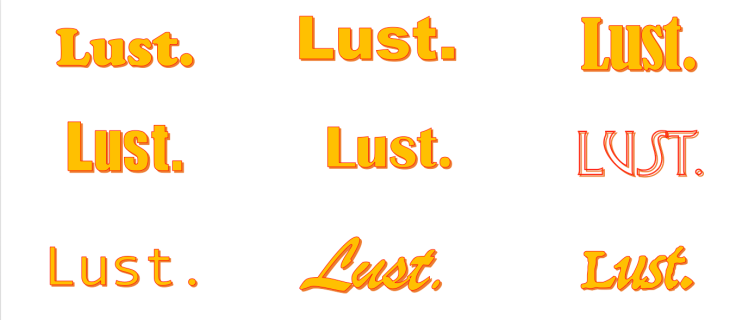
For the titles I will be editing in my finished video I am inspired to re-create Quentin Tarantino’s bold yellow titles. When a character appears I want the titles to be bold and stand out as I’m having my film in black and white. I would like for the titles to just appear on screen to add an impact affect. I have created a mood board of my ideas for the titles.
I have messed around with the font types on word so for when I go on after effects I know what kind of font I want. I have then gone onto after effects to for a rough look at how I want the titles to appear.
I really like my first font because the font is basic but it has the curvy edges so it doesn’t look average.
I also like my second font because it’s bold like a statement and I feel like it would look good when coming into my video but then again it’s a rather basic font.
I like my third font because it’s like the first font but it’s close together which looks more appealing in my eyes however I’m not sure it would look good in my video.
I’m not to keen on my fourth font because of how simple it looks. It could look good with my video because the colour will strike against the plain text but I want it to look symbolic.
I like my fifth font because of how the font style is but again I feel it looks to simple to stand out against my video.
I really like the font of my sixth text because it stands out against the others and what catch your attention. But, people might find it hard to read and I want it to be thick with the colour yellow.
My seventh text is to simple for me and I don’t like how far the letters are from eachother. I like the fact the yellow will look more bright against the background but it isn’t bold enough.
I like my eight font because of how it nice it looks with the slant and curly font and is catching because it’s not simple. But again I want the text to be thick like my others as that’s what I want.
I like how the font is for my ninth text because it’s slanted, thick and you can read it. But i wanted a text that looks like it’s make a statement and it doesn’t to me.
Overall I have decided to use the third text because it’s bold, striking and makes a statement from how the font is. In my opinion it stands out most against the others by what I want it to be like. When the text will come onto my video i want it to be bold in the centre and by picking that font i think that’s what I’ll get.
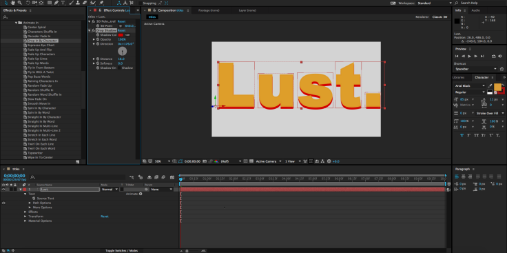
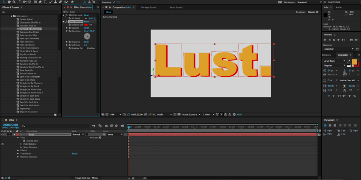
I went onto after effects to play around with how I’m going to create my titles and I was able to alter at which side and how big I wanted the red shadow which is exactly what I want to be able to do. I have been also trying the effects. For example one effect is called ‘drop in by character’ where each letter drops down into the screen . Which in my head would be a good idea but I don’t think it would be fast enough to say the name of the character for how long the is scene for, but it’s an option I like. There’s also another effect called ‘fly in from the bottom’ where each letter shoots in from the bottom at a fast pace which could also work, however it still might not be fast enough for each persons name as they are long. I found a font which is called ‘straight in by word’ which is where the whole word slides in from the side and I think this will really work because it’s fast enough for the pace of the video and I think it will have a smooth impact.

Leave a comment