Title sequences can be one of the most important features in the programme or film itself, because it presents you characters and key aspects. Also due to the image and sound it shows you what kind of show you are watching, which is always important. The three TV programme title sequences I have chosen to study is Twin Peaks, The X-Files and Breaking bad. I believe these title sequences are some of the best and that’s why I chose them to study.
Twin Peaks.
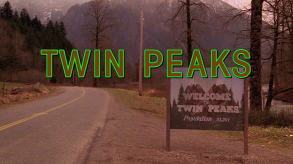
Twin Peaks is a phenomenal TV series and everything about it is truly great. One of the key features to this is it’s title sequence. The entire sequence itself is like art the way the music fits together with the scenery. The reason I particularly like this sequence is how it it’s calm and doesn’t have a lot going on but even so it draws you in. For example the sequence doesn’t give anything away as it shows no characters or certain elements in the show itself, the sequence keeps it secluded. I like how the shots are of places in Twin Peaks which are actually key parts of the story which you don’t get to see a lot, so in a way the sequence reveals all these aspects from the start. With these certain parts of Twin peaks being shown it instantly gives me an idea in my head that these certain places have some sort of importance to do with the show. For example it shows you the Twin Peaks sign with it’s population on the board but this all changes because of the murder case. Also with the sequence it gives you warm tones, nothing bright or dark. So when the title is show it has a bold green outline that instantly catches your attention. This bold green against the warm tones I find really works and fits in.
What I really like about this sequence is how art form it is. All the shots are really pleasing to the eye just like the show itself. What I don’t like about the sequence is how it’s at a quite slow pace with the motion, but I guess that’s the effect they were going for.
The X-Files.
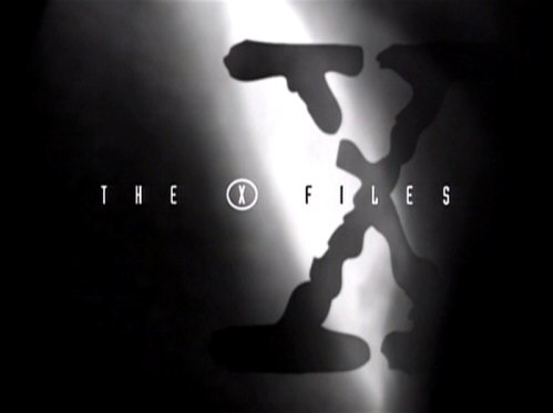
I really like the title sequence for The X-Files as the music fits perfectly with the theme and imagery. As the show is about the unknown and extra terrestrial life it shows you clips of morphed faces and what is supposedly to be footage of ghosts etc. By doing this they’re instantly giving you a hint of what the show is mainly about and I believe this will have drawn a lot of attention as it’s different and interesting. Also in the sequence by first showing the two main characters it shows you their FBI badges and this instantly tells you that they’re actually agents seeking the truth, not some locals. I found this to be something that would create even more attention to viewers as it’s not seen before normally. The theme song fits together with the theme as it gives an eerie intense atmosphere and I feel they made this work well. From watching the sequence you instantly know what kind of audience it was made for like adults or teens. The sequence opens up with the title in a thin font with a shadowed X behind it which instantly sets the mood with the dark tones used. Using the thin white font really strikes bold against the imagery during the sequence.
What I really like about this title sequence is the images and and footage used as it all links together to create an image in your head of what could happen. What I don’t like about the sequence is how it’s at a quite fast pace with all that’s going on it could be slowed down a little bit.
Breaking bad.
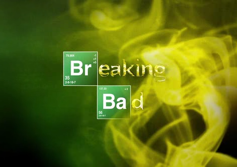
Breaking bad’s title sequence is short but fantastic. It opens up with with periodic table symbols moving on wards as the sequence goes on, which when watching this you instantly think of science. As the sequence goes on more symbols and bits of the periodic table are shown, equalling in Br and Ba being highlighted then spelling breaking bad. The way they formed this was genius because it does not only show what the series is linked to but it shows it together in the title as well. The backing music used is at a fast pace with the pace of symbols moving and I find it ties in really well to make the sequence. Also solid bold green is used as a background which really makes the title stand out against it. Also when the title is shown some yellow/green smoke is blown over as to symbol something again. Throughout the sequence only small snippets of clues are revealed and I feel that draws you in even more because you want to know what it’s about. Warm bold tones are used in this sequence which again could symbolise something.
What I like about this sequence is how it’s done with the symbols and the movement of the title, of how it’s then formed because it’s so creative. What I don’t like about it is how the sequence is so short, and this can be a good thing to make you wanna see more. But, I feel like if the sequence were to be longer it would have been even more great.

Leave a comment