For my portfolio website comparison I have chosen ‘Laura Bellingham’s website and Chris stone’s website.
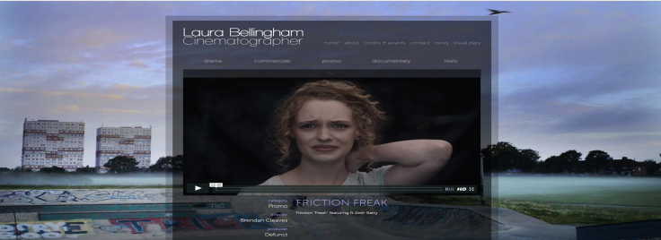
With the design settings for Laura Bellingham’s website it has a striking affect to me as the background gives you a set mood. The colour theme’s are dark tones like grey is used as a sheer background behind one of her main features. Laura uses a basic font in white but is bold in front of her background which makes it stand out. She uses a vary of different fonts but that are similar, so nothing is massively a change to the others. The graphics used are a basic logo that isn’t striking but says it all. The logo says who she is and what she does, so from looking at the logo you instantly know what her business is. Her background is actually from one of her pieces of work and is of a landscape with an area of graphite flats. This shows you immediately a piece of her work and already you want to see more. The general design is basic yet bold. Her background creates an image and with her main feature of a reel of all her footage planted in the middle. She’s designed her categories in a blur until you hover your mouse over them which they then become clear. This is a good trick to make you do this to see what it says and have an interest in looking.
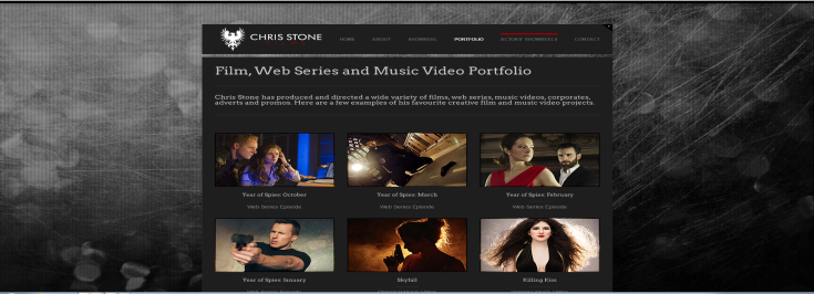
With the design settings for Chris Stone it also gives me a set mood. It’s bold but plain as same with Laura’s he uses dark grey tones. The background is a grey background that looks like it’s been scraped like a piece of metal. Also the background behind his videos is also a shade of grey which doesn’t really stand out but then it does make the videos stand out. The font Chris has used is also white like Laura’s which does stand out against the grey so I can see why they chose this. Chris uses the same font for near enough everything on his page and the font is also plain and white like Laura’s. The graphics used in Chris’s website is a bold logo that would catch your eye instantly. He has used at what looks like some sort of dragon in white with his name at the side of it in a skinny bold font also in white, but then below his name it says ‘films’ in the same font but in a bold red. Chris has been smart with thinking of this logo because by using a dragon it gets many different peoples attention and using the little amount of red also makes it strike out bold. The general design is sort of similar to Laura’s as they use the same colour tones and fonts. His page is also plain but bold. However with Chris when clicking onto his main page it gives you a choice of quite a lot of his films to choose from. Chris also uses categories at the top of page where you can find his contact info and what he’s about etc.
Laura’s page opens up with a video on her main page which contains a reel of some of her work. This allows you to get an insight of what kind of things she has created in a sense of style. I think this is a great idea to have on her main page as you don’t have to go looking for what kind of work she does. Her page also contains categories such as ‘drama’ ‘commercials’ etc at the top of her page, which means you get to pick what kind of genre she has created if you were looking for a particular thing. Also in smaller printing at the very top of her page she has various pages you can click on that take you to her awards and if you wanted to contact her etc. Each of her pages are similar as they all have the same dark tone atmosphere with the same sort of font. Also each page is small but it’s enough and contains the amount of information that is needed.
Chris brings you straight off onto a page full of all of his work that he has created. I like that he’s done this because the first thing he shows you is all his creations. This shows you that he is serious at his work as he has created a lot and they all look up to standards and interesting. All of Chris’s pages have the same colour and the same background. Compared to how Laura mashes up with her background Chris’s isn’t not really striking. Chris doesn’t have categories like Laura does at where you can pick what kind of video you would like to see and I feel like this is an important thing to have on your page. Each page seems the same because of the same colour and background but even so he features many different things on many different pages which I like, as you then have a variety.
Some of the main features I like about her page is that having her contact page on her main page is helpful as sometimes you have to go looking for this kind of information and it can be quite annoying. Also what I like about Laura’s page is that it’s basic yet it has a lot going on. By this I mean she features a lot like her reel video and different categories that are the main things you want to see and they stand out. Her main page isn’t long as it has a few categorises to choose from rather than sticking everything on one page. None of her features are clustered and it all seems tidy. Another feature that I think works well is that when you go onto different pages the background is always a snippet from a piece of her work. I think this feature really works well as it sets the scene and also is good at promoting her work. Some of the features that I don’t think worked well is that with her categories it gives you a choice of whether you wanna see a drama or a commercial. So when you hover over a specific category the videos drops down under the category but I was quite confused as all the videos were together and wasn’t exactly specific on what was what.
A feature I think is really good of Chris’s is that when you click on his logo it takes you to a page where there’s a slideshow of his most popular work. And by doing this you’re seeing his best creations.Also another feature is that some of his pages are quite long which some people may find frustrating but they’re not too long. Same with Laura’s page his contact page is also on his main page. Chris’s page also appears quite plain but it does have a lot going on as every page holds valuable information. The features Chris’s uses for instance how he brings you straight onto a page full of his work is good at promoting himself. Some of the features I don’t like is how he doesn’t change his background and on every page it’s the same. If he changed his background I feel it would stand out more. Also because his background isn’t really striking I feel as if this makes his website a bit boring as nothing is exactly standing out to me.
From researching these websites I have gained many ideas at what I want my own website to be like. For instance from looking at Laura’s I really like how she has a reel of her work on her main page. As I think that was a really smart move at her promoting herself. Also I like how on different pages her background is always of work she has done. Also with Laura’s website I like how she’s kept it simple but bold and that’s how I’d like mine to be. When looking at Chris’s I want to create a striking logo like he has. Having a bold logo is really important and I feel like he really grasped that. Also with Chris he has a lot going on in various of his pages and I’d like to do that as then I feel my website would get attention if it had a lot to look at.
A skill I will need to create my own website is to learn specific knowledge of the software I will be using. The skills I will need to gain to create my own website will be how to market the website. How I’d sell it to people because it has to be different otherwise it isn’t going to stand out against others, I need the skills of how to draw an audience in. I will also have to know how to run my own website, as that can be difficult. I would also need to know how to structure a website and how to grasp tiny key details.

Leave a comment